If you read our white paper, "Taking a Responsive Approach: Responsive Web Design in the DNN CMS," you probably already know that Google has sung the praises of responsive design, claiming it to be its "preferred site configuration."
But, did you know that you can use Google Analytics to gain insight on your need for a responsive site? Follow these steps, and you’ll be able to tell if you should spend more attention to better serving your small-screen audience through responsive design.
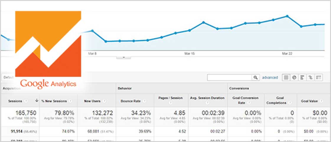
- STEP 1: Log into your site's Google Analytics account and head over to the Reporting page.
- STEP 2: On the left-hand navigation, click Audience > Mobile > Overview, and you’ll get a report of your traffic.
- STEP 3: Select the "pie chart view" in the upper right-hand corner, and you'll see a clear breakdown of the percentage of users that have viewed your site on mobile and tablet browsers.
Current statistics show that 30% of visitors view websites via a mobile device. So, if your site is below 30%, it could mean one of two things: Either you’re not providing an optimal mobile experience, or, simply, your target audience isn’t yet a mobile audience. Of course, you know your business best, so you will need to determine which of these two scenarios is the case. 
You can also use Google Analytics to see exactly which pages are attracting mobile visitors. Turning again to the left-hand navigation, selecting Audience > Behavior > Page. Compare the resulting report to that of the desktop pages. Do these numbers surprise you? Do their differences make sense (i.e. a page with directions to a location would be more popular on mobile than on desktop)?
With the insights you’ve found from Google Analytics – and your understanding of your business, target audience, and its website's goals – take time to consider what you could do to improve the mobile users' experience. If you haven't already, check the site on your own phone or tablet. Can you easily find the things you'd hope to see? If not, it's time to get responsive.
Download our free white paper. Looking to get started on your responsive site? Contact us for a free consultation.