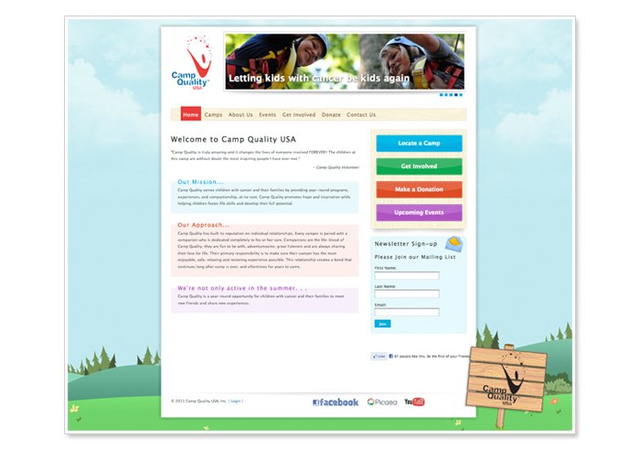
Camp Quality USA serves children with cancer and their families by providing year-round programs, experiences, and companionship, at no cost. Camp Quality promotes hope and inspiration while helping children foster life skills and develop their full potential.
We felt like kids heading to camp each day working with Camp Quality - excited, inspired, giddy. Providing Camp Quality with a web site that reflects the experience they provided to campers was a true joy.
We recently launched 14 regional camp sites that reflect the branding established by Camp Quality USA, while allowing each camp to have it's own specific content.
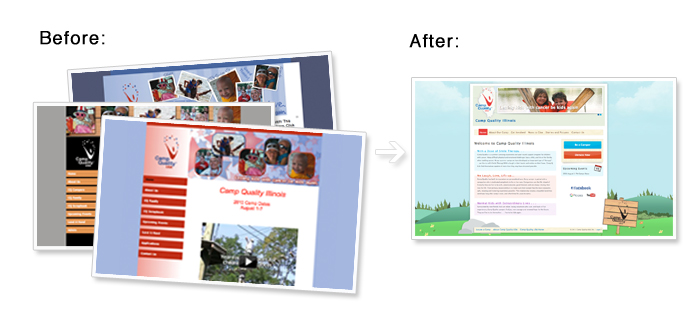
The Challenge
The main challenge to the site redesign was evident - there was a lack of consistency between sites, some readability issues, and overall the sites didn't reflect the warmth and hope Camp Quality was serving up. We needed to properly frame these success stories, and give users the best chance to get involved by referring a camper, volunteering, or simply just being inspired by what Camp Quality does.
Project Goals
The goal for the new design was to infuse the overall site integrity with the joy that we were feeling helping out with the project. We wanted to try to harness the same inspiration that Camp Quality was promoting. The aim was for the site to be extremely friendly to parents and kids alike; not just visually, but also from a usability perspective.
Design
Playing off of the Camp Quality branding, our designer-extraordinaire, Anthony Overkamp started building out hand-drawn backgrounds to help drive home the sense of being at camp. Even though every camp experience is surely different, we went with a universal outdoors feel, including a wooden post sign to anchor and welcome you to the site. These elements helped surround the content with a feeling off warmth and light. We used bright, contemporary colors for navigation items to give users cues for getting around the site. We used tints of these colors to help frame and separate content, allowing users to quickly identify section of the site. We also included some friendly icons for call-out section, and a set of hand-drawn and colored social media icons.
The main site and the individual camp sites share a lot of the same design features with just a few differences. The individual camp sites include a global navigation element at the footer of each site linking back to Camp Quality USA for users to learn more about the organization as a whole, and quickly find other camps. We've styled this navigation to be an extension of the main navigation and framed it out with some more hand drawn elements to tie it to the design- as well as add more fun to the site. Another major difference to each individual site is the custom branding. Each site shares the same branded logo, so there was a challenge to let users know which site you were on immediately. We added the title of the site, but also included a custom background banner with the camps region defined by a simplified outline of the state they're located in. This helped users quickly identify the region of the camp they're looking at, as well as bring in some more subtle separation between camps.
The Results
We were so happy with how the site turned out we wanted to share it (show it off) and get the word out about Camp Quality. We also entered it in the DotNetNuke Site of the Month Contest for June. Vote today!